Example: Exchange servers
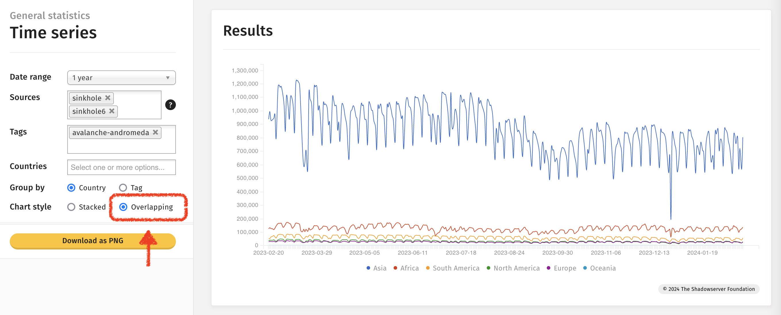
General statistics · Time series
A stacked graph showing the number of IPv4 & IPv6 addresses detected responding each day over the past week, globally, tagged as CVE-2023-36439.
General statistics · Visualization · Table
A table showing the number of IPv4 & IPv6 addresses detected responding each day over the past DAY, globally, tagged as CVE-2023-36439.
General statistics · Tree map
A tree map showing the number of IPv4 & IPv6 addresses detected on a set date, tagged as CVE-2023-36439, with the number per country represented proportionally.
Clicking on a country segment gives a breakdown of sources plus general statistics sourced from the CIA world factbook.
Example: Exposed CWMP devices
General statistics · Time series
A timeline showing 2 years’ worth of historic data (the maximum span in public dashboard) - in this case for Saudi Arabia demonstrating the number of exposed CWMP device IP addresses detected each day.
Note: This graph shows a vast improvement in terms of CWMP exposure at the end of January 2023
Example: MISP instances
IoT device statistics · Visualization · Bar chart
A number of devices and software solutions can be fingerprinted during scanning. This graph shows (on a logarithmic scale) the number of IP addresses detected each day on average, over the past month, with MISP instances running.
Example: Exploited vulnerabilities
Attack statistics: Vulnerabilities · Monitoring
The top 100 detected attempted exploitable vulnerabilities (out of those Shadowserver monitors in our honeypots), initially sorted by number of unique attacking IP’s over the past day.
Clicking the Map option allows the user to swap between “Source” and “Destination” Host Types (i.e. attacking IP geolocation Vs honeypot IP geolocation).
Note: An attacking geolocation may or may not accurately represent the location of the attacker themselves.
Example: Interpreting events
Using the dashboard to help interpret events: Anomalous increase in exposed CWMP devices (believed Huawei home routers) in Egypt, followed by Mirai attacks originating from the same country.
Note: Shadowserver worked with Egyptian nCSIRT to notify & remediate.
IoT device statistics · Time series
Observation of increase in volume of exposed IoT devices announced on Egyptian infrastructure on/around 2023-01-05.
IoT device statistics · Tree map by vendor
Stepping backwards and forwards through dates shows devices likely to be newly visible Huawei devices from 2023-01-05.
General statistics · Time series
Associated spike in exposed CWMP detections from scanning matching the 2023-01-05 spike.
Shadowserver honeypot sensors identified suspected Egyptian compromised devices launching Mirai and brute force attacks.
And corresponding Telnet Brute Force attacks emanating from Egyptian compromised devices.
Using multiple sources and selecting Tag and Overlapping options allows for the observations to be rendered on the same graph.
Example: Special reports
Occasionally Shadowserver releases one-off special reports. We announce the data on X/Twitter and on our website - but after the event you might want to know the relevant dates. A way to find the dates is to use the Time Series chart looking for Special Report dates - and then you can transfer those dates into other representations better suited to single day statistics (such as maps or tree maps). Special reports have source set to special on the dashboard.
Searching for Special Reports on a Time Series chart:
Tree map for an example Special Report found on 2024-01-29:
For a list of Special reports please review the list of reports on our main website. Special reports will have “Special” in their name.
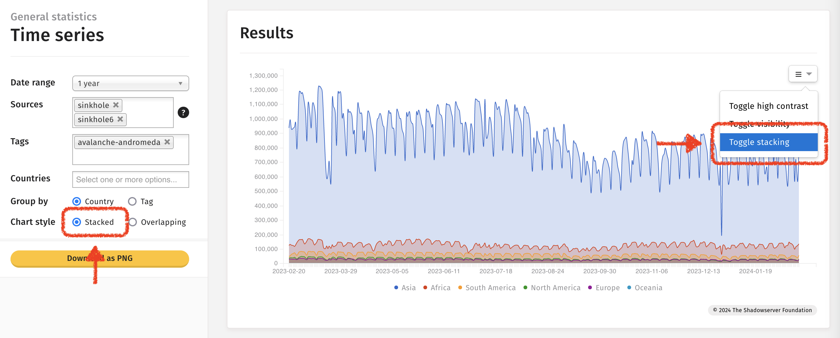
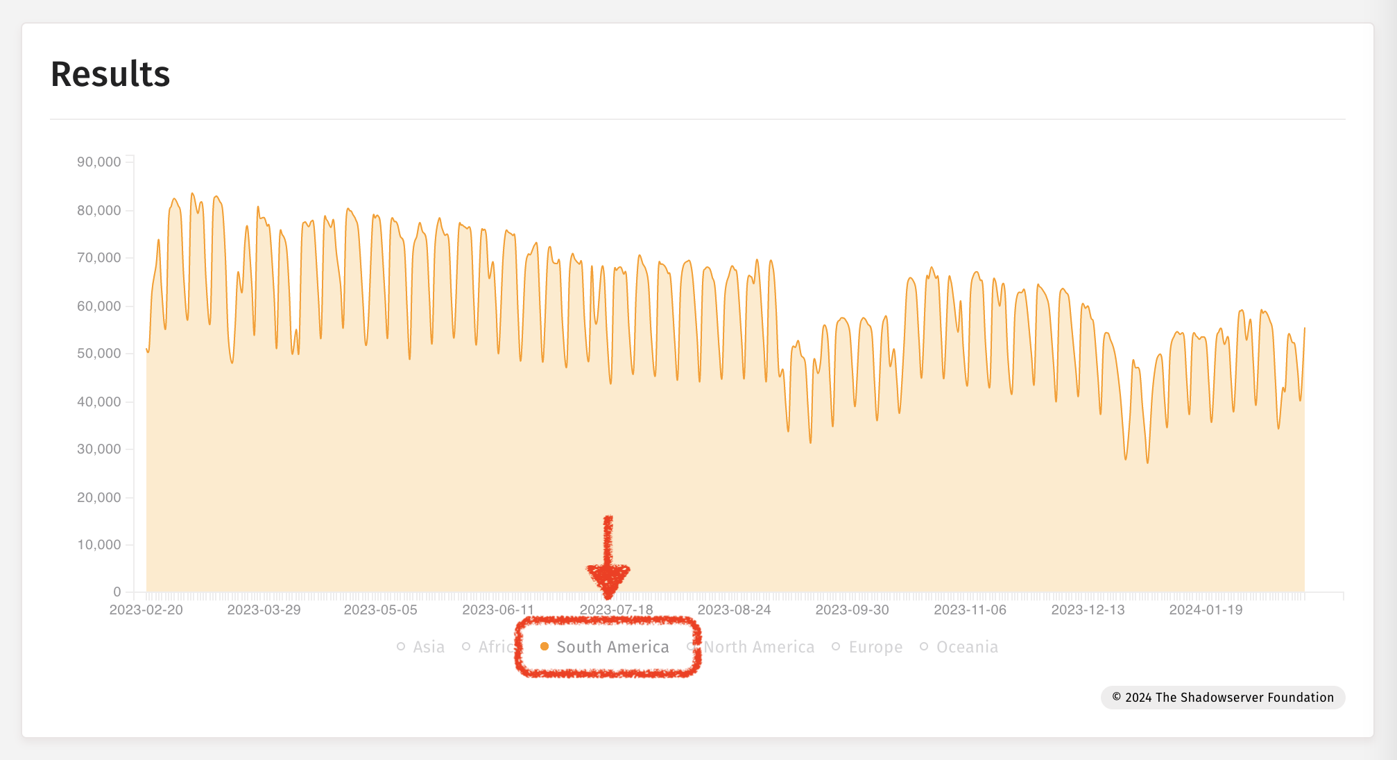
Example: Time-series charts
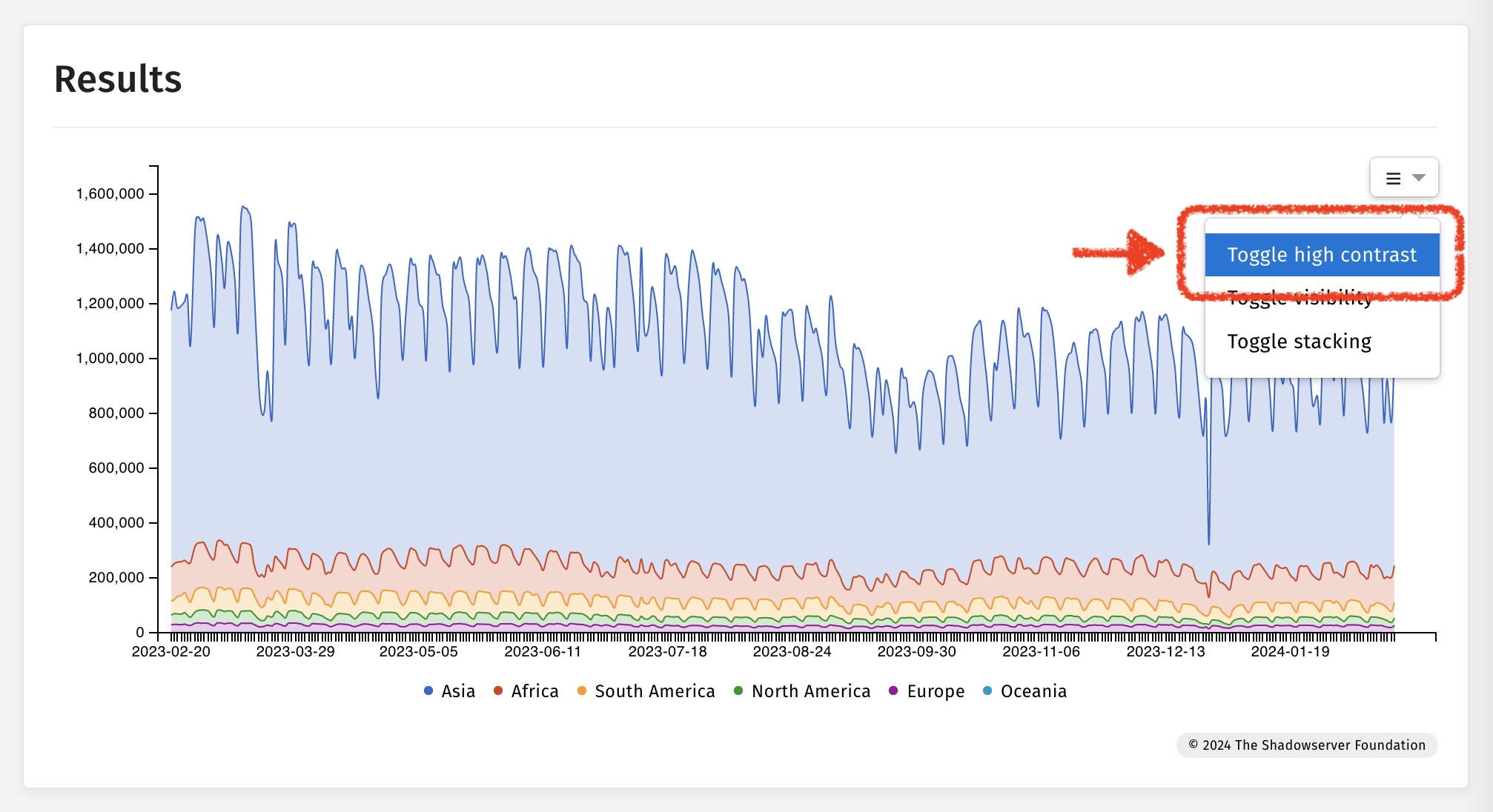
Toggling high contrast
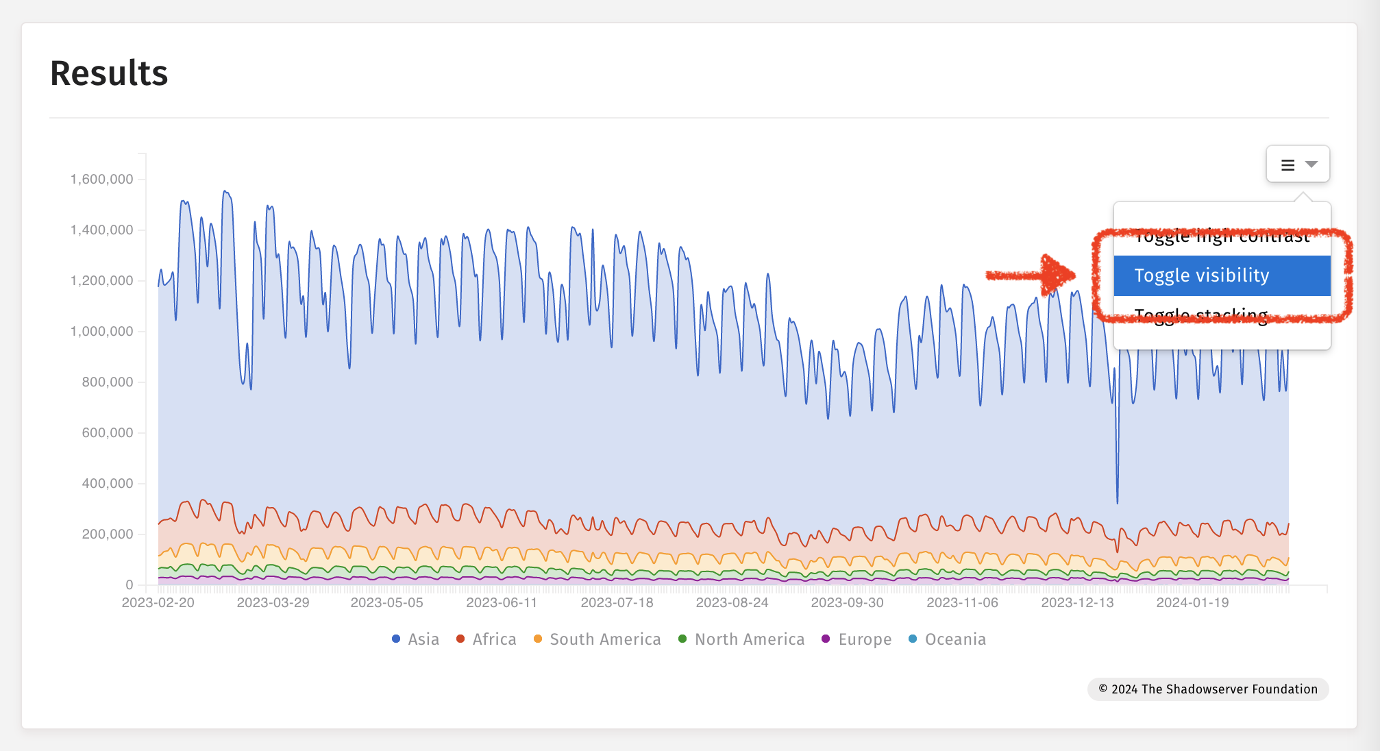
Toggling visibility
Toggling stacking