Halimbawa: Mga exchange server
Pangkalahatang istatistika · Serye ng oras
Isang nakasalansan na grapikong nagpapakita ng bilang ng IPv4 & mga IPv6 address na na-detect na tumutugon bawat araw sa nakalipas na linggo, pangdaigdigan, naka-tag bilang CVE-2023-36439.
Pangkalahatang istatistika · Visualization · Table
Isang talaang nagpapakita sa bilang ng IPv4 & mga IPv6 address na na-detect na tumutugon bawat araw sa nakalipas na ARAW, pangdaigdigang, naka-tag bilang CVE-2023-36439.
Pangkalahatang istatistika · Tree map [Mapa ng puno]
Isang tree map na nagpapakita ng bilang ng IPv4 & mga IPv6 address na na-detect sa isang nakatakdang petsa, naka-tag bilang CVE-2023-36439, kasama ang bilang kada bansa na proporsyunal na may kumakatawan.
Ang pag-click sa saknong ng bansa ay magbibigay ng breakdown ng mga pinagmulan kasama ang pangkalahatang estatistika na kinuha mula sa facebook ng CIA world.
Halimbawa: Na-expose na mga device na CWMP
Pangkalahatang istatistika · Serye ng oras
Isang timeline na nagpapakita ng halaga ng 2 taon ng makasaysayang datos (ang pinakamalaking haba sa publikong dashboard) - sa pagkakataon na ito para sa Saudi Arabia na nagpapakita ng bilang ng na-expose na mga device na CWMP IP address na na-detect bawat araw.
Tandaan: Ang grapikong ito ay nagpapakita ng malawak na pagbabago sa termino ng pagkakalantad ng CWMP sa pagtatapos ng Enero 2023
Halimbawa: Mga MISP instance
Mga istatistika ng IoT device · Visualization · Bar Tsart
Isang bilang ng mga device at solusyon na software ay maaaring ma-fingerprint sa oras ng pag-scan. Ang grapikong ito ay nagpapakita (sa isang logarithmic scale) ng bilang ng mga IP address na na-detect bawat araw sa karaniwan, sa lampas nakaraang buwan, na may mga MISP na instance na gumagana.
Halimbawa: Pinagsamantalahang kahinaan
Mga istatistika ng atake: Mga Kahinaan · Minomonitor
Ang pinakamataas na top 100 na na-detect ay naghangad na subukan ang mga kahinaan (mula sa mga Shadowserver monitor sa ating mga honeypot), paunang isinaayos gamit ang bilang ng kakaibang pag-atake ng mga IP sa nakalipas na araw.
Ang pag-click ng opsyon na Map ay nagpapahintulot sa mga user na mag-swap sa pagitan ng “Source” at “Destination” na mga Host Type (hal. pag-atake sa IP geolocation Vs honeypot IP geolocation).
Tandaan: Ang isang umaatake na geolocation ay maaari o hindi tumpak na kumatawan ng lokasyon ng mga umaatake mismo.
Halimbawa: Pagbigay kahulugan sa mga kaganapan
Paggamit ng dashboard upang makatulong bigyang kahulugan ang mga kaganapan: Maanomalyang pagdami sa nalantad ng mga device na CWMP (pinaniniwalaang mga Huawei home router) sa Egypt, kasunod ng mga atakeng Mirai na nagmumula sa parehong bansa.
Tandaan: Nakipagtrabaho ang Shadowserver sa Egyptian nCSIRT upang ipaalam & mag-remediate.
Mga istatistika ng IoT device · Serye ng oras
Obserbasyon sa tumataas sa dami ng nalantad na mga IoT device na inanunsyo sa Egyptian infrastructure noong/malapit sa 2023-01-05.
Mga istatistika ng IoT device · Tree map ayon sa nagbebenta
Ang pag-atras at pag-abante sa mga petsa ay nagpapakita sa mga device na malamang ay mga bagong nakikitang mga Huawei device mula sa 2023-01-05.
Pangkalahatang istatistika · Serye ng oras
Kasamang pataas sa pagkaklantad ng mga deteksyon na CWMP mula sa pag-scan na tumutugma sa pagtaas noong 2023-01-05.
Tinukoy ng mga shadowserver honeypot sensor ang pinaghihinalaang nakompromisong device na Egyptian na nagpapalabas ng Mirai at brute force na mga pag-atake.
At ang katumbas na pag-atake ng Telnet Brute Force ay nagmumula sa nakompromisong mga device ng Egyptian.
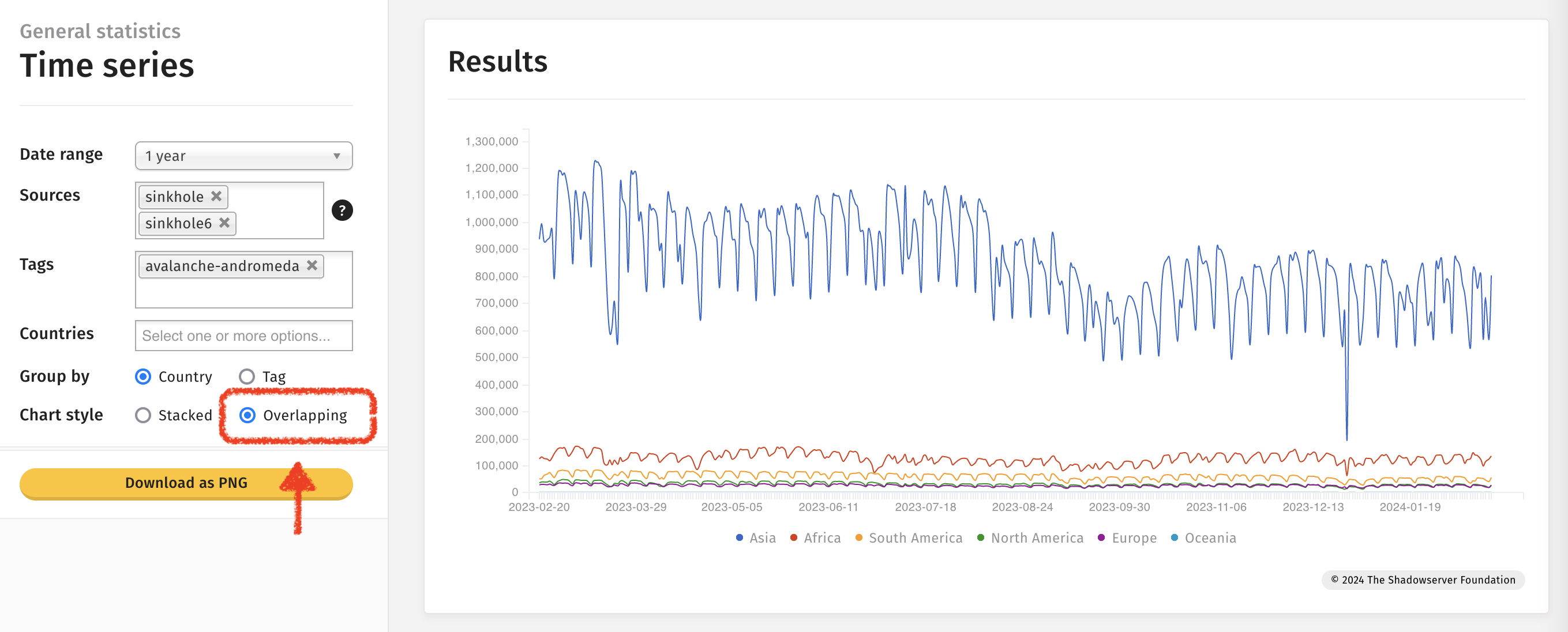
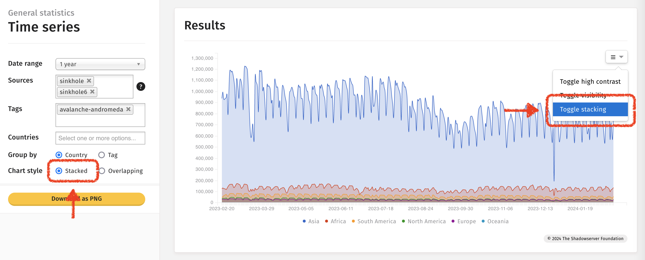
Ang paggamit ng maramihang gamit at pagpili ng Tag at mga opsyon na Overlapping ay nagpapahintulot sa mga obserbasyon na gagawin sa kaparehong graph.
Halimbawa: Espesyal na mga ulat (Special reports)
Panaka-naka inilalabas ng Shadowserver ang isang hindi ka-uri na espesyal na mga ulat (special report). Inanunsyo namin ang datos sa X/Twitter at sa ating website - ngunit matapos ang kaganapan maaaring nais ninyo malaman ang mga kaugnay na petsa. Isang paraan upang makita ang mga petsa ay sa paggamit ng Time Series na tsart na naghahanap para sa mga petsa sa Special Report - at matapos ay maaari na ninyong ilipat ang mga petsa na iyon patungo sa ibang presentasyon na mas mainam sa isang araw na istatistika (tulad ng mga mapa o tree map). Ang mga special reports ay nakaset ang source sa special sa dashboard.
Paghahanap ng mga Special Report sa isang tsart na Time Series:
Halimbawa sa tree map ang Special Report ay makikita sa 2024-01-29:
Para sa isang listahan ng mga Special report mangyaring rebyuhin ang listahan ng mga report sa ating na pangunahing website. Ang mga special report ay mayroong “Special” sa kanilang pangalan.
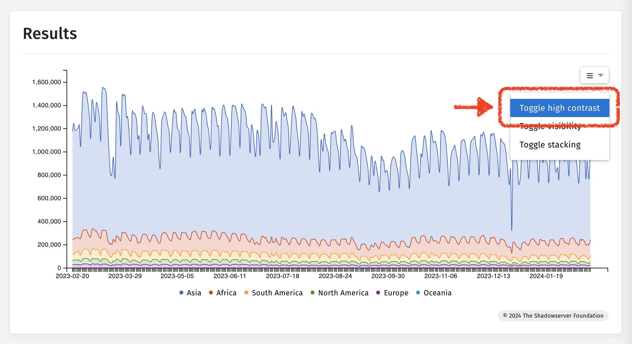
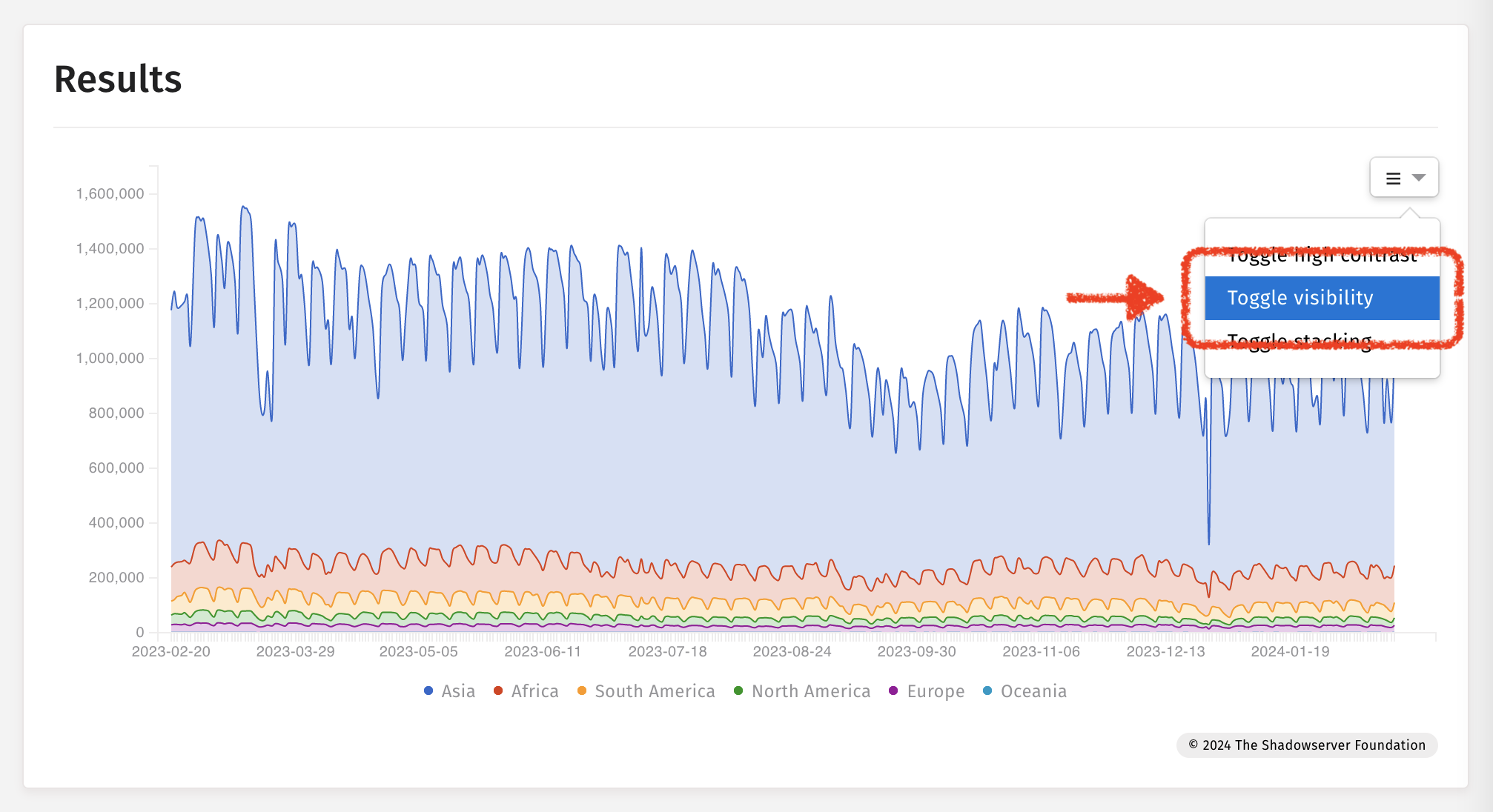
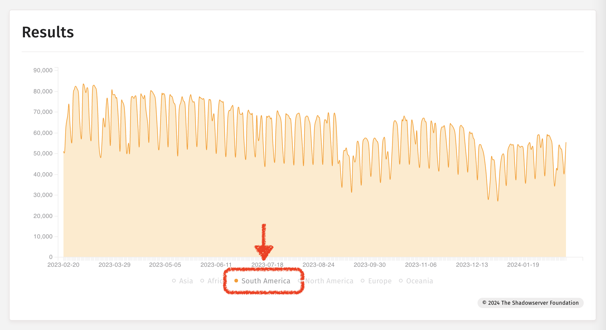
Halimbawa: Tsart ng serye ng oras
Pag-toggle sa high contrast
I-toggle ang visibility
I-toggle ang pagkasalansan